CASE STUDY
Can Branding A Horse
Change A Sports Team Image?
Igniting Fan Excitement and Support
Delaware Blue Coats Logo Redesign
Overview
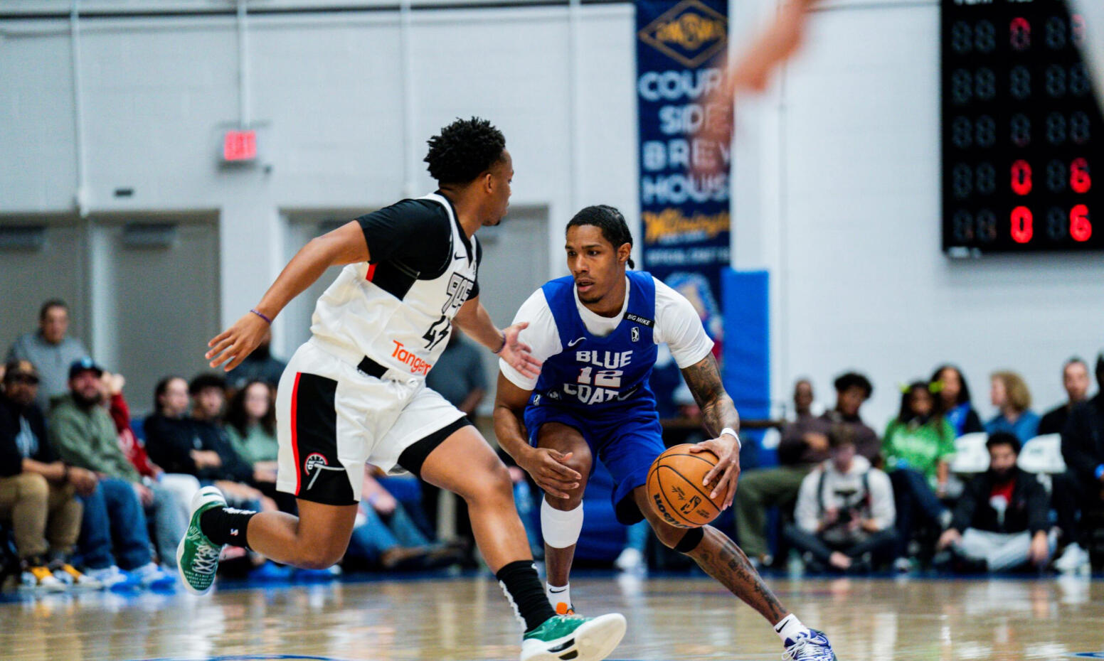
The Delaware Blue Coats are an American professional basketball team in the NBA G League based in Wilmington, Delaware. They are the G-League affiliates of the Philadelphia 76ers.Could a rebrand increase fan excitement, engagement, and support?
Role
Designer, Creative Direction
Problem & Background
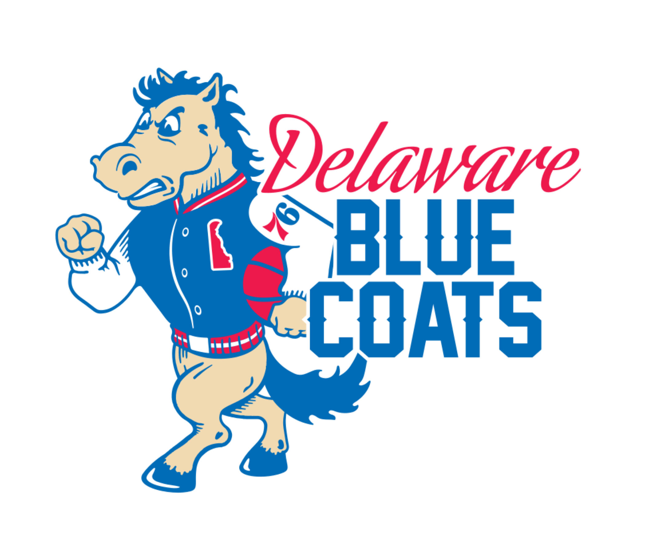
The original logo had a playful, cartoonish style featuring an anthropomorphic horse in a varsity jacket. While nostalgic, it lacked the aggressive edge necessary for a professional sports team.The mascot felt more like a school emblem than a pro sports identity.I wanted to challenge myself to redesign their current logo for a more "modern feel" to exude more strength and competitive energy.
Goal
Create a brand identity that is bold, modern, and professional that exudes strength and competitive energy for deeper emotional connection and fan engagement.I wanted to create an identity that enhanced the team's visual identity and strengthened its connection to the Philadelphia 76ers, but also improved brand versatility across merchandise, marketing, and digital media.
Research
I started by analyzing NBA and G League logos to understand design trends and competitive aesthetics.I also researched the historical significance of the Blue Coats name and its ties to Delaware, and studied the Philadelphia 76ers branding to create visual synergy between the two teams.
Brainstorming & Design
After researching numerous designs to convey the strength and determination through the horse’s expressions and poses, I picked typefaces that would be legible but still bold and worked on colors that stood out to match the team’s overall look.Once I had a strong concept, I used digital graphic design software to create and refine the design to enhance the composition and reinforce the team’s competitive spirit,I adjusted the blue and red tones for vibrancy to ensure clarity across different product applications.
Before & After
Hopefully, I can demonstrate from the side-by-side comparison that the revision isn’t just an update—but a statement.Hopefully, it reflects the energy, intensity, and professionalism of a team ready to compete.For the Delaware Blue Coats, this redesign wasn’t just about aesthetics. It was about stepping up their presence and owning their identity.
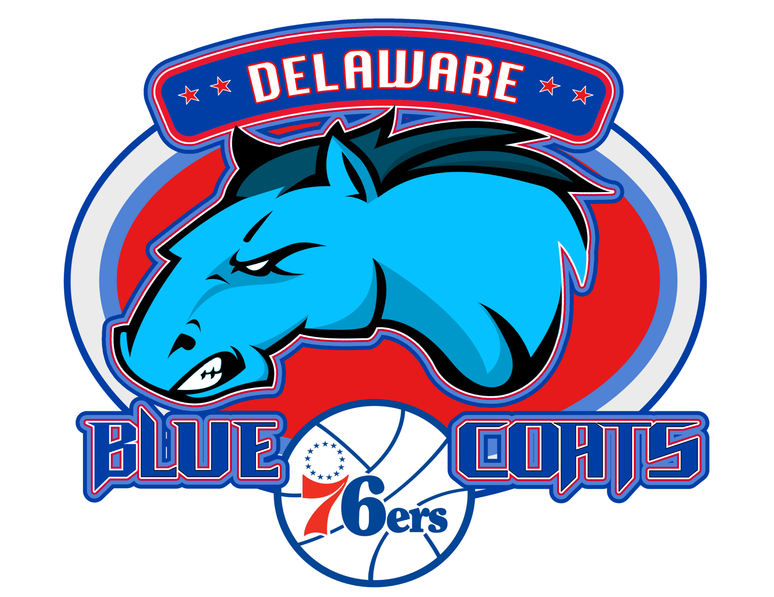
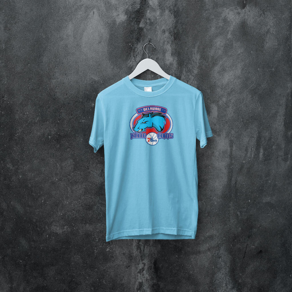
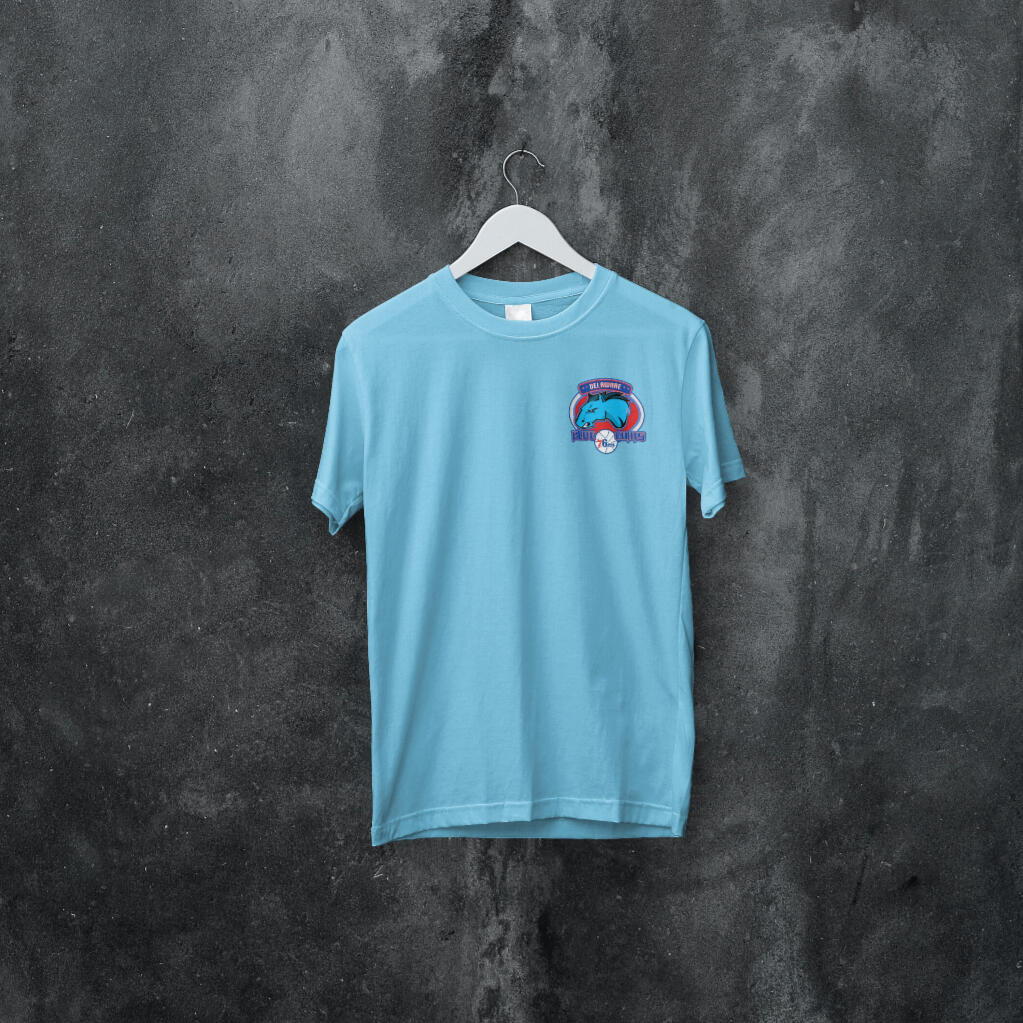
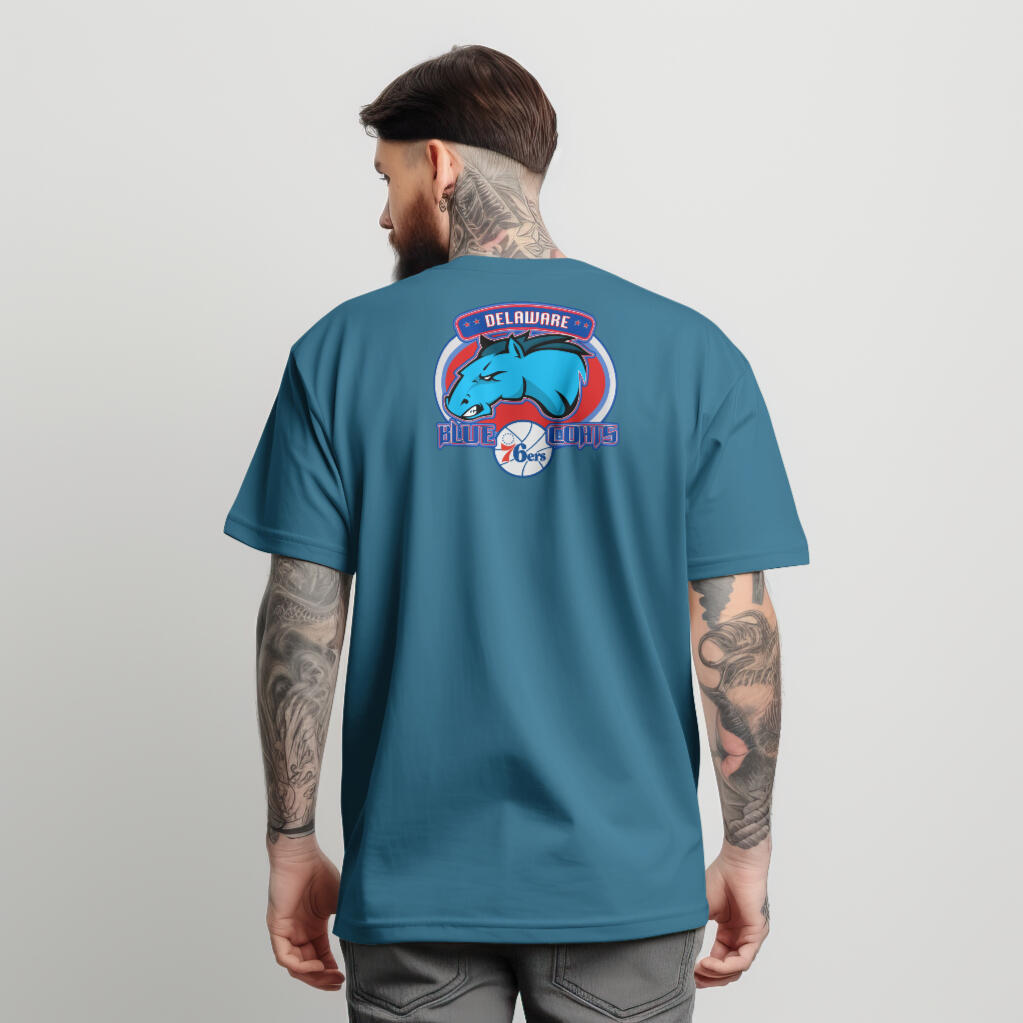
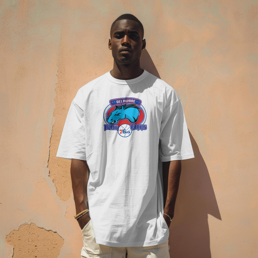
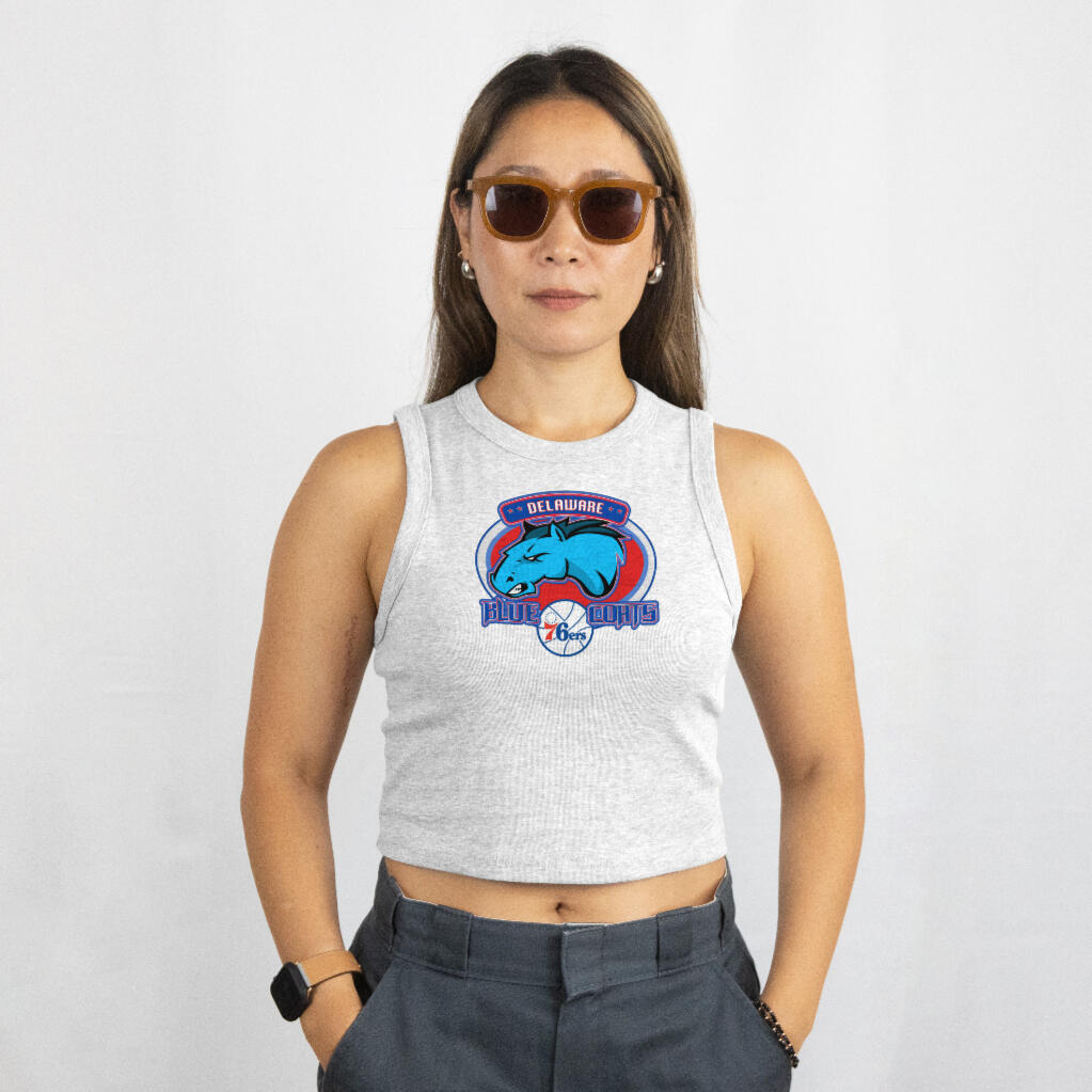
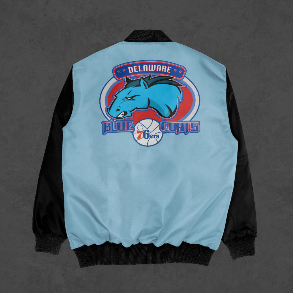
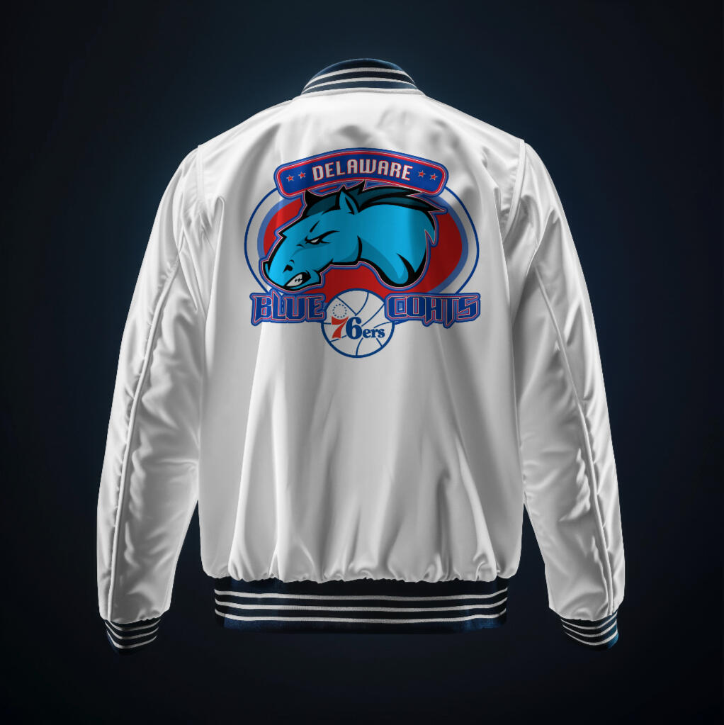
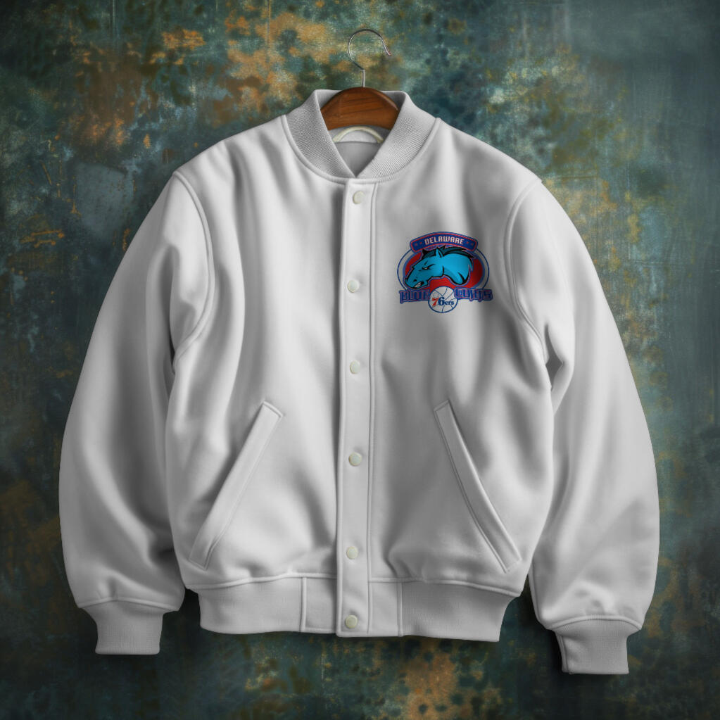
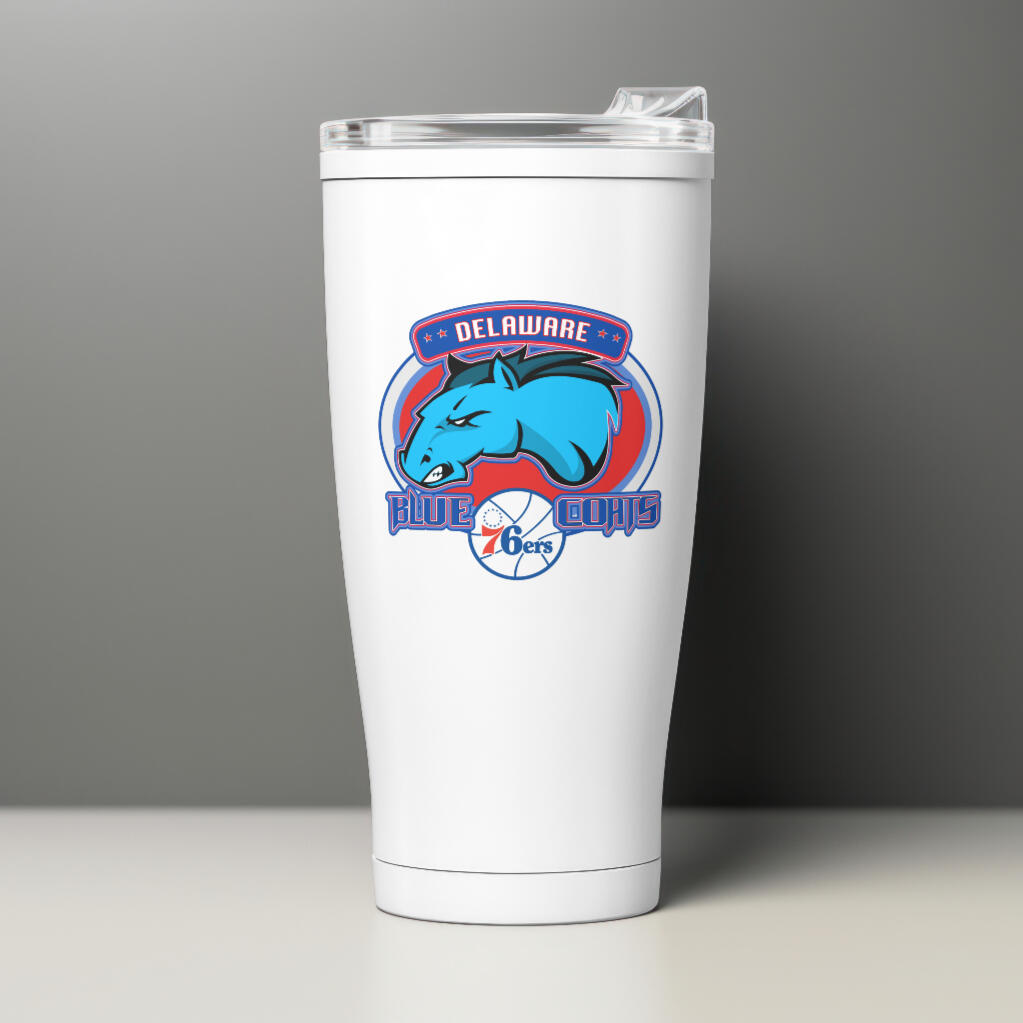
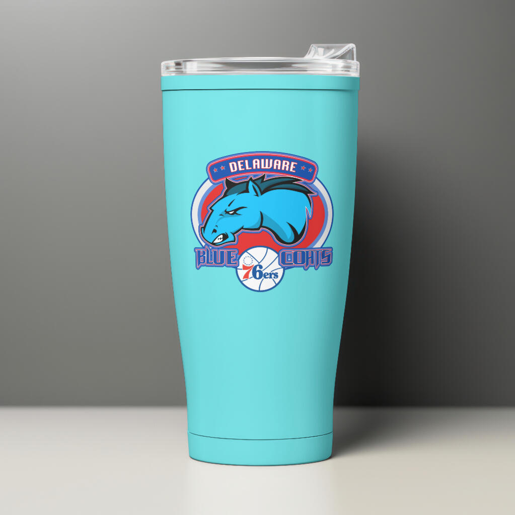
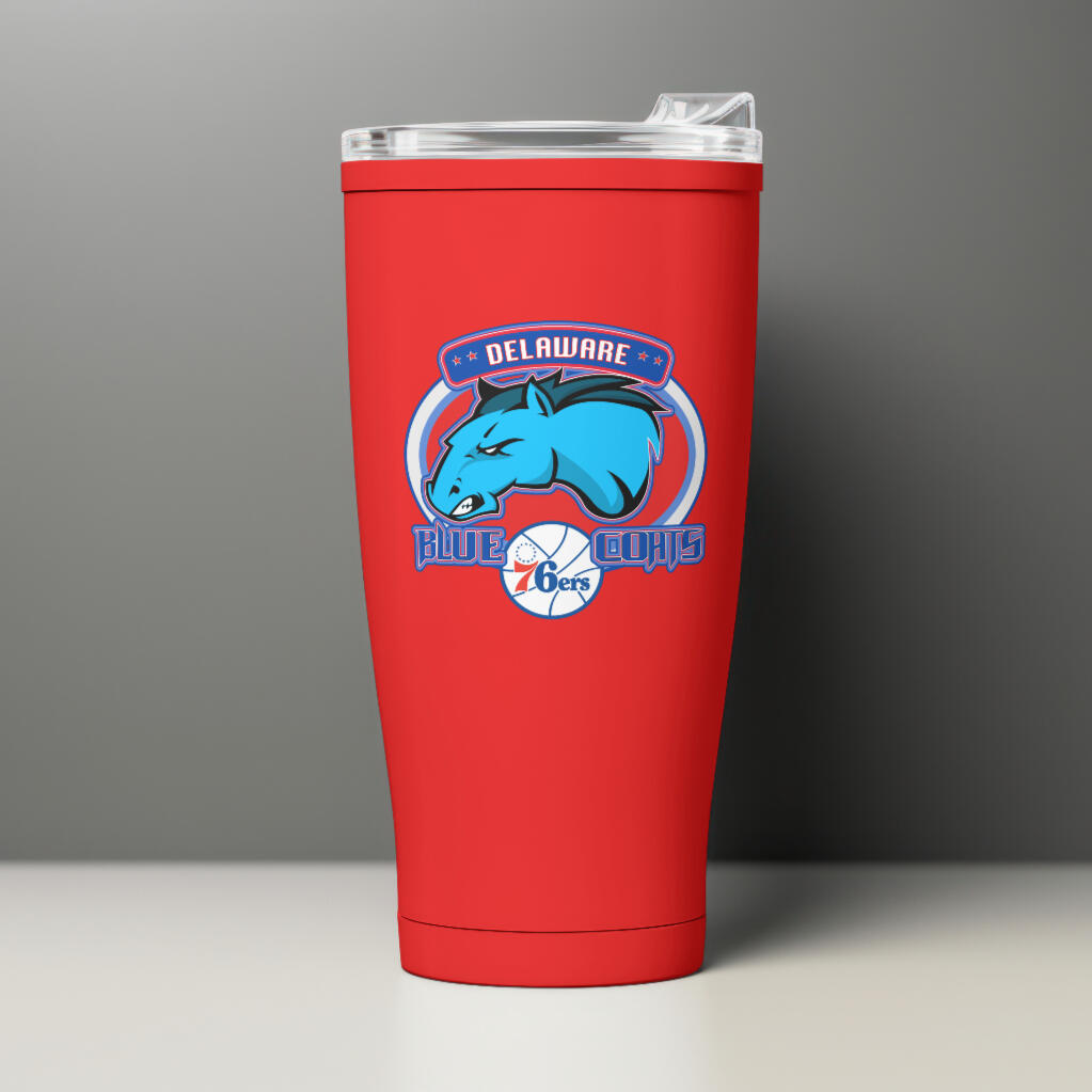
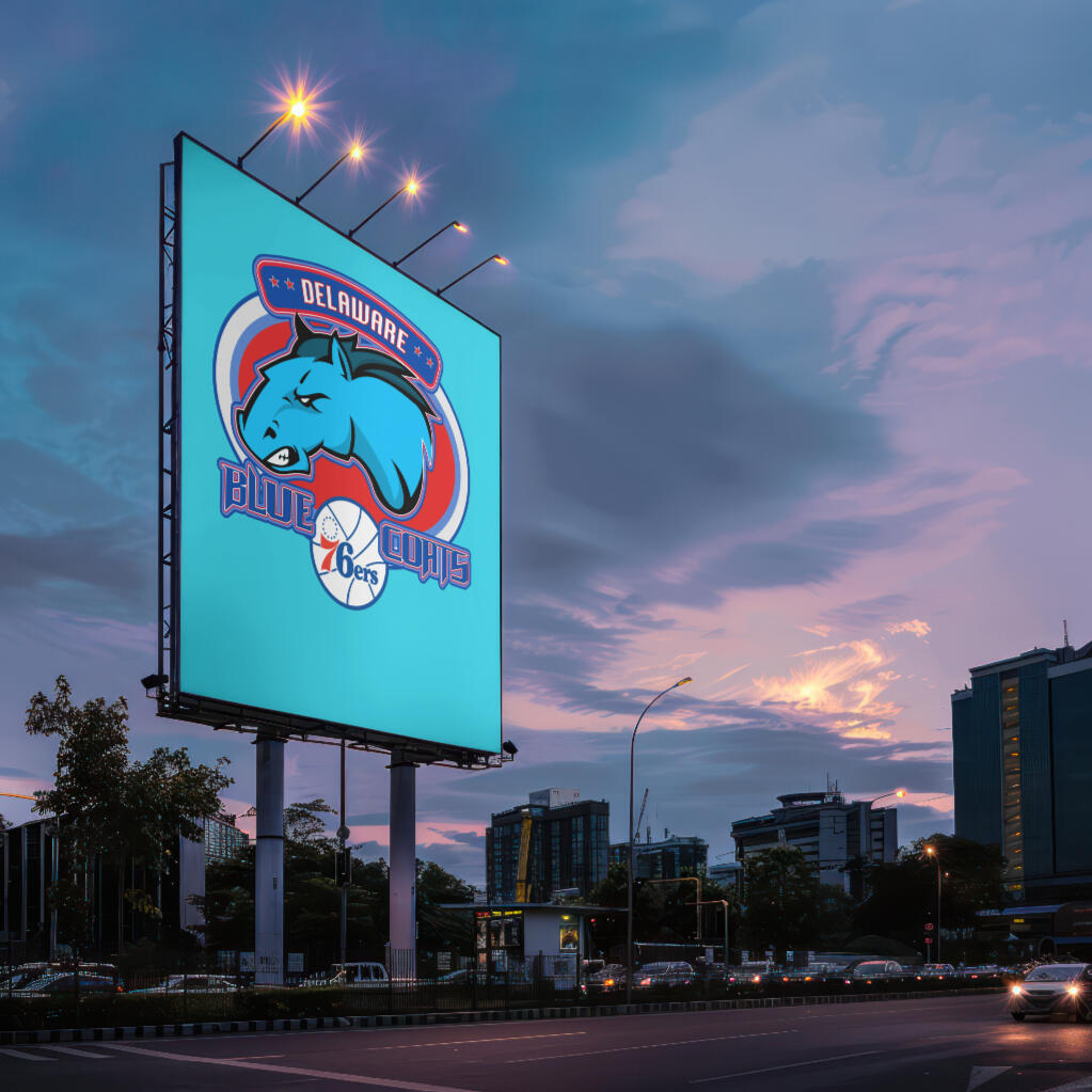
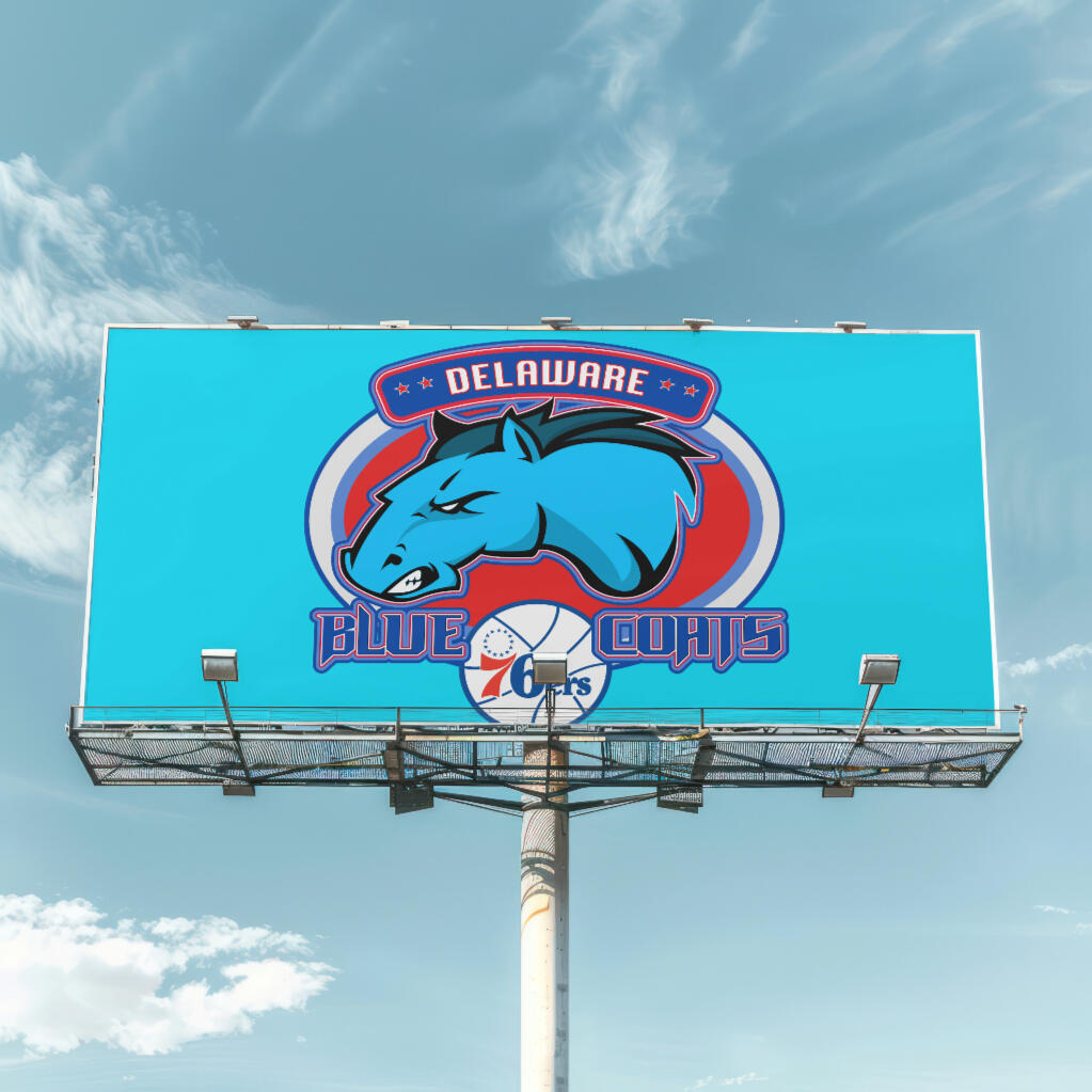
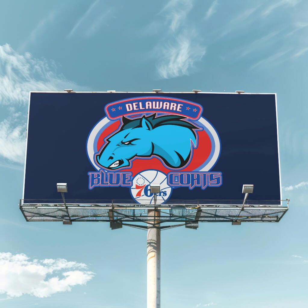
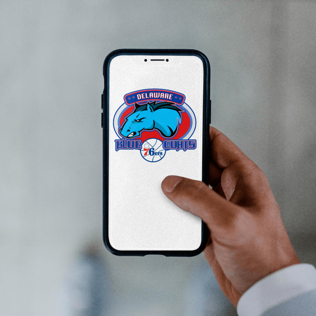
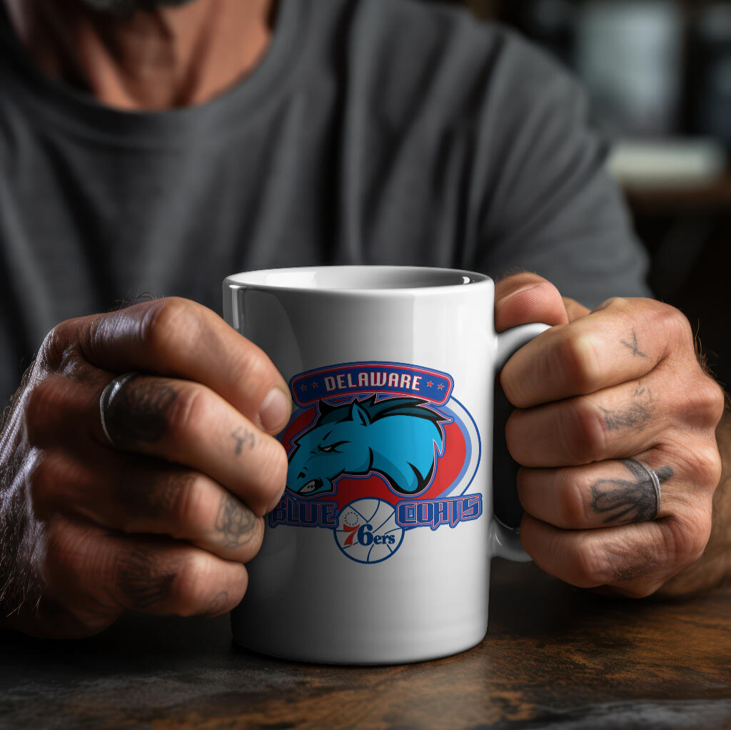
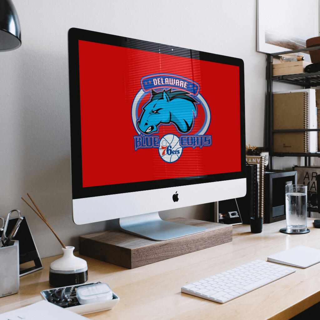
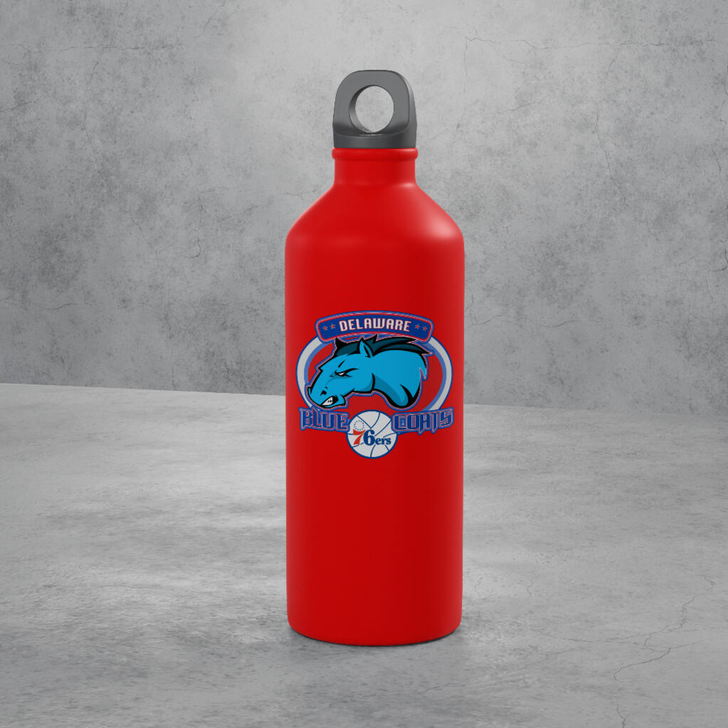
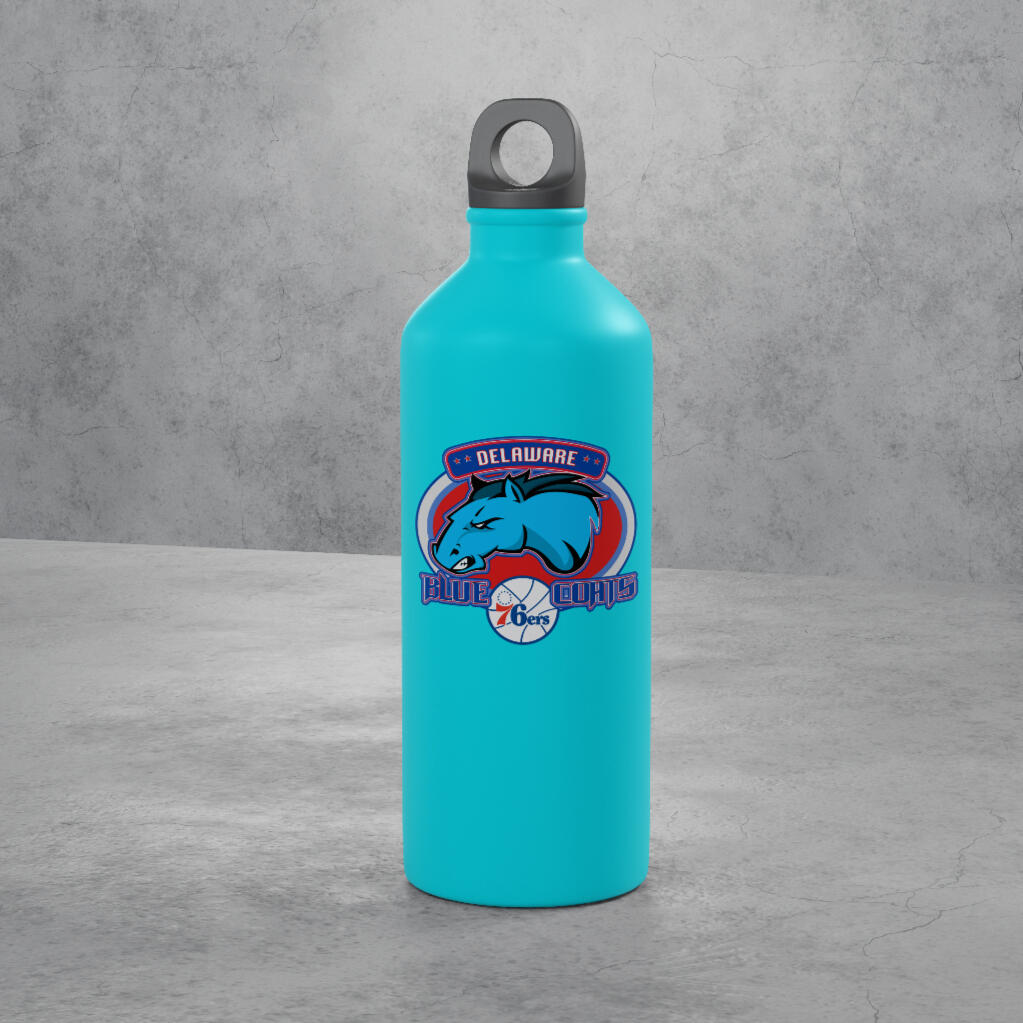
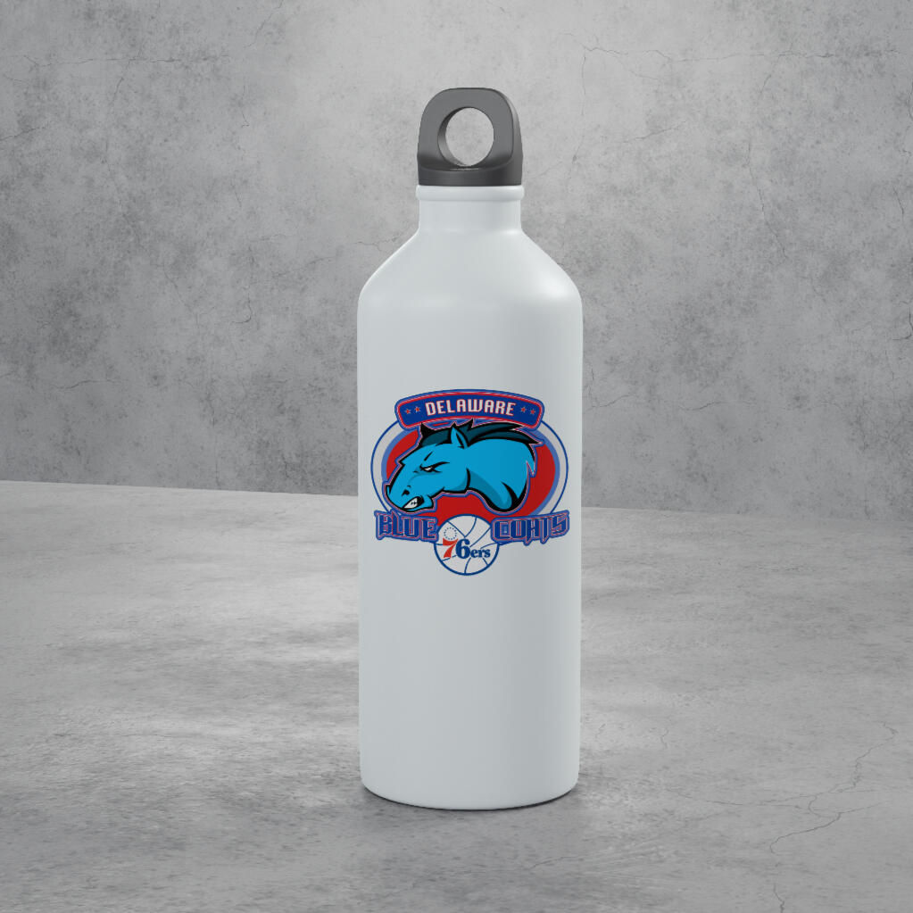
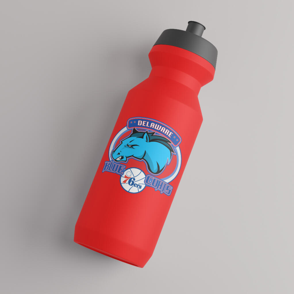
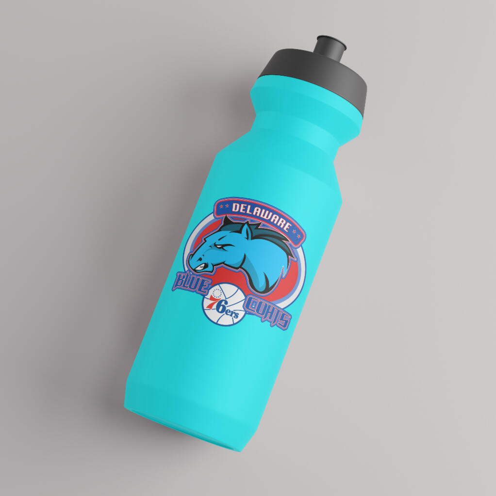
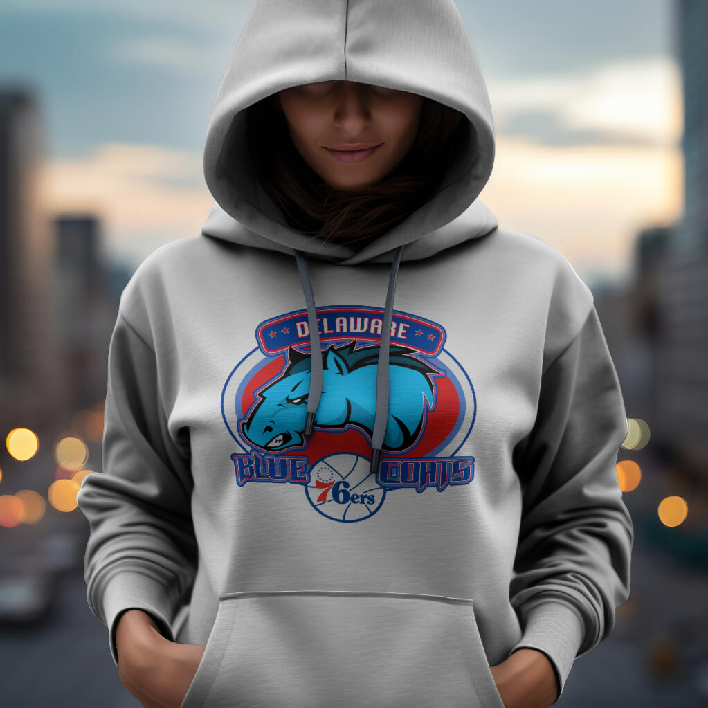
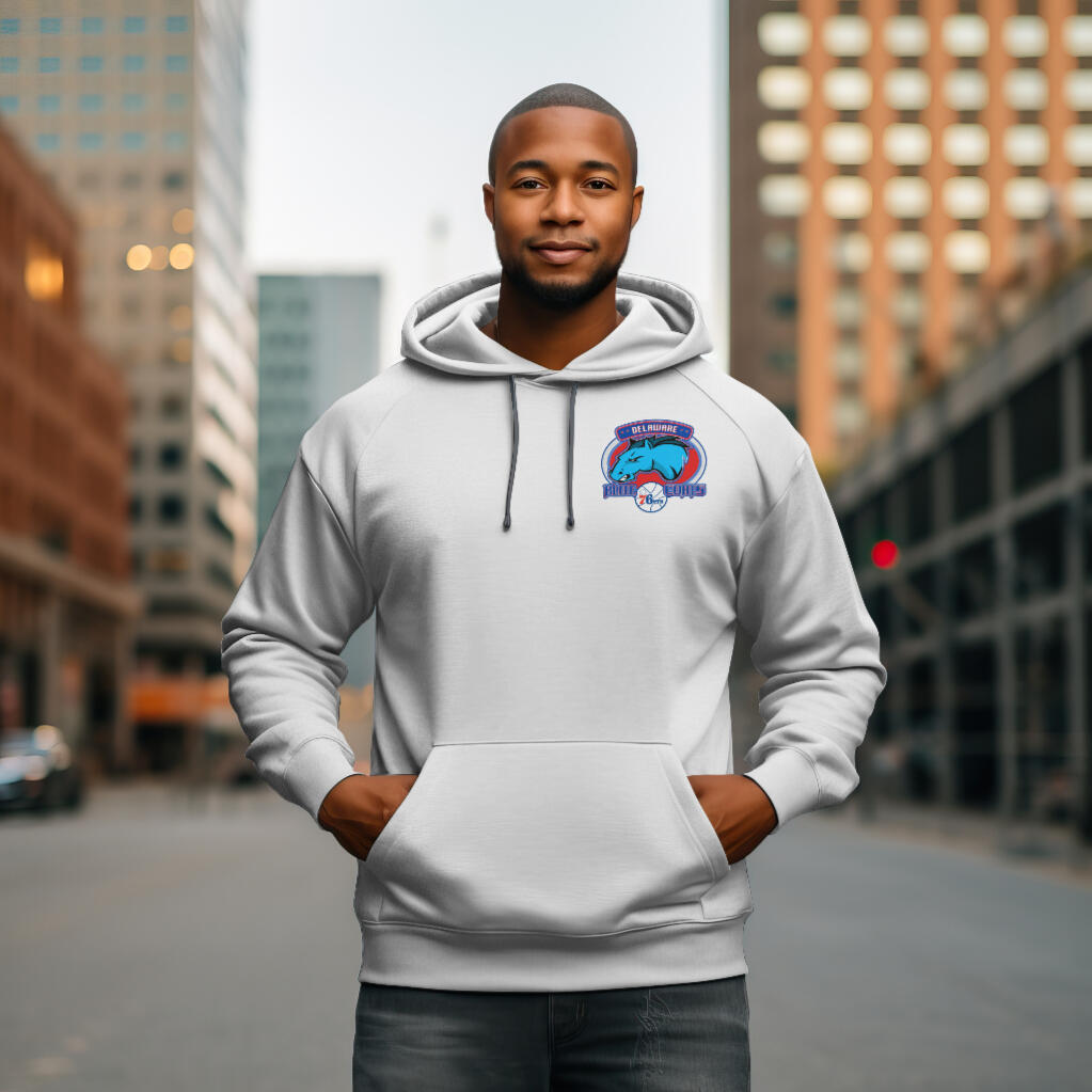
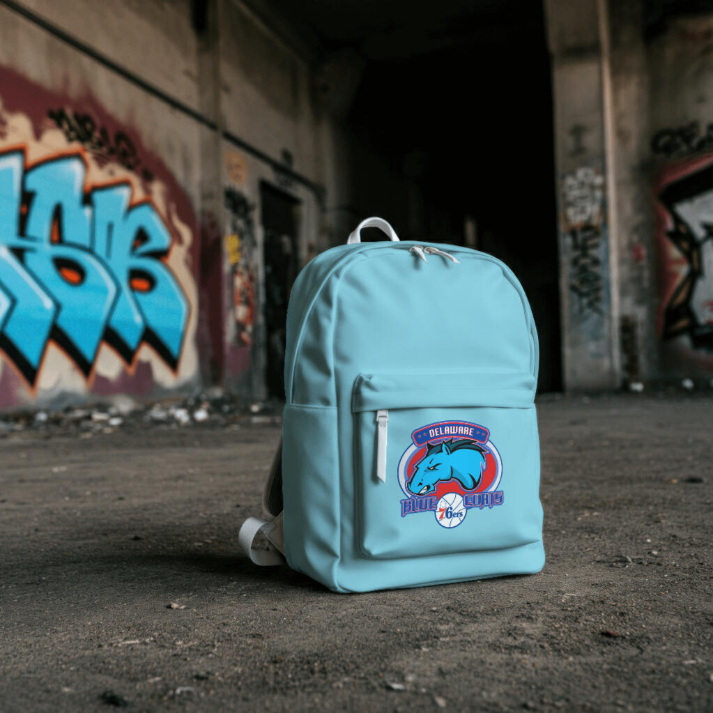
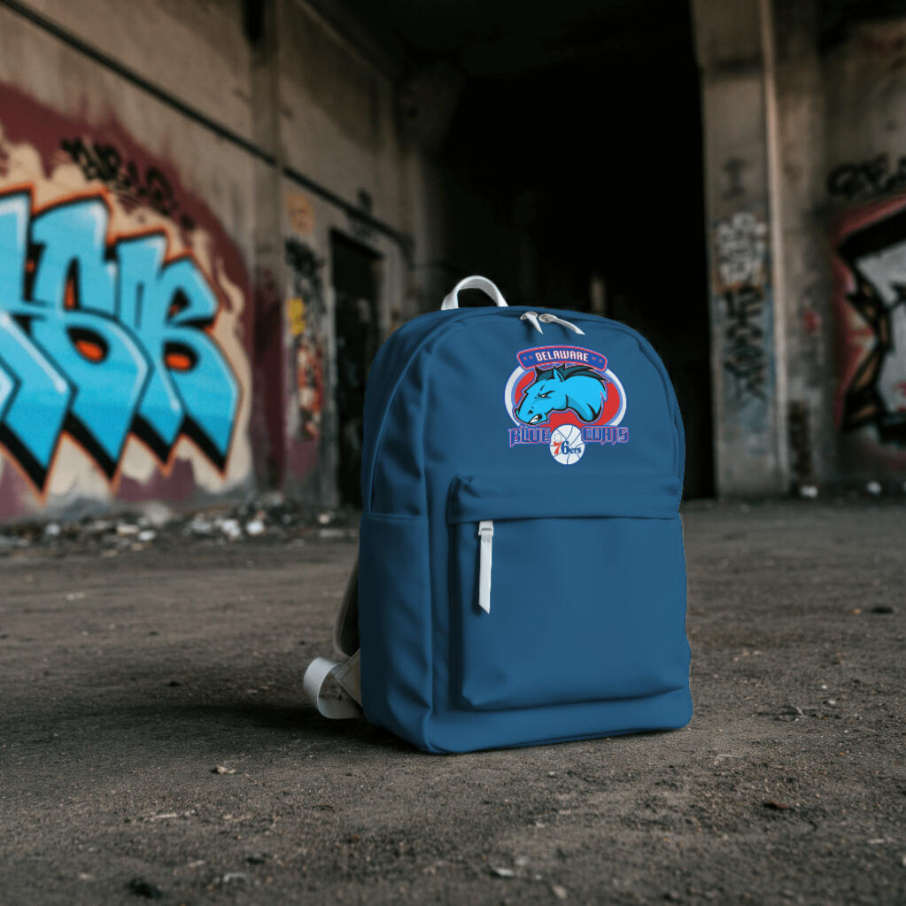
Final Delaware Blue Coats Logo Design Revision created in Affinity Designer
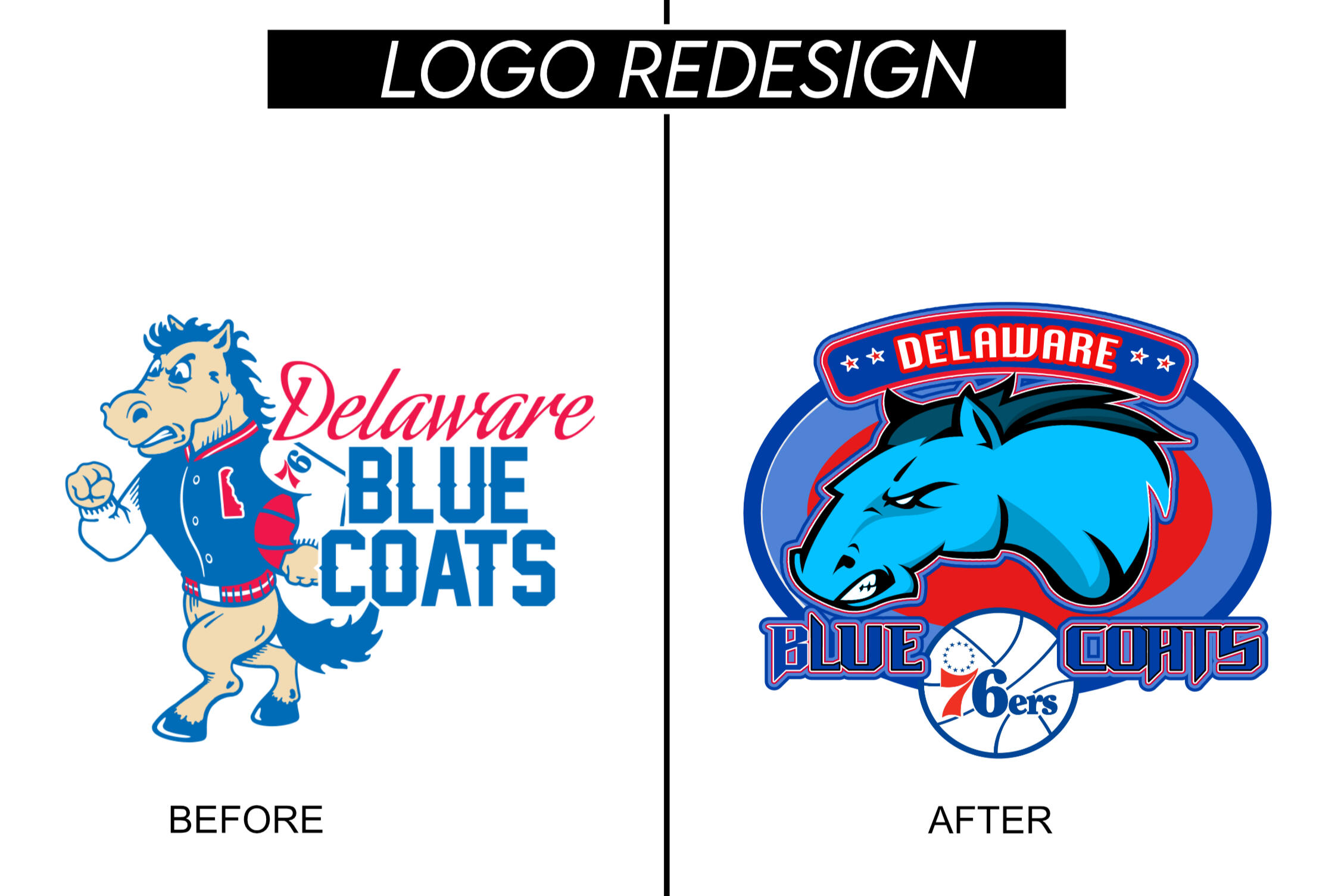
"Before" & "After" Logo Redesign
challenges
One of the biggest challenges was finding the right balance between tradition and modernity. The Blue Coats have a rich history, and I wanted to respect that while ensuring the new logo felt powerful and contemporary. Additionally, scalability was a key consideration, requiring multiple refinements to maintain clarity across different mediums.
Lessons & Key Takeaways
Simplicity Enhances Versatility: A strong, clean design ensures adaptability across various platforms.Consistency Matters: A cohesive visual identity strengthens brand recognition and impact.Final Takeaway: Design Is Strategy
A logo isn’t just a picture—it’s a brand’s first impression, competitive edge, and rallying symbol.
Conclusion
This redesign transformed the Delaware Blue Coats’ brand, giving them a fierce and professional identity that commands attention.By balancing modern aesthetics with historical elements, the new logo strengthens the team’s presence in the G League and beyond. This project reinforced my belief in the power of thoughtful design to elevate a brand and make a lasting impact.